…
We display and sell the products of over 60 area artisans who take pride in the quality and originality of their handmade art & craft!
…
…
Northwoods Pioneer Gallery & Gifts, formerly Pioneer Crafts Co-op, was founded in 1971 and first opened for business on Memorial Day 1972. It was started by several small local craft organizations with assistance from the Arrowhead Economic Opportunity Agency (AEOA).
The original purpose of the association was to provide a way to market the craft products of Northeastern Minnesotans, particularly low-income and elderly persons, and to carry on educational activities in the art and craft field. The membership requirements have since been revised to include all local artisans, regardless of age or income, who want an outlet for their quality art and craft products.
We moved to our current location in the Spring of 1999 after the construction of the Silver Creek Cliff tunnel was completed on Highway 61. Our new location is about 7 miles further up the shore from the tunnel. (11 miles from Two Harbors).
As a cooperative, all members contribute in some way to the operation of the shop. The primary responsibility is to tend the shop as sales clerks. Our members may be offering demonstrations while they tend the shop in such varied techniques as wood working, painting, beading, jewelry making or wheat weaving. Such crafts reflect the heritage of the pioneers of Northeastern Minnesota. Sharing the love of their art and craft is a wonderful experience for the members!
…

…
Northwoods Pioneer Gallery & Gifts
Open daily 10:00 am – 5:00 pm
2821 Highway 61
Two Harbors, MN
at Castle Danger
Shop My Closet: Unique consignment boutique opens in Uptown! – Minneapolis, MN

“Spoonbridge and Cherry”
Walker Art Center
…
“Deciding on a place to call home can be a tough process,” the study states. “You’ll need to balance things like the cost of living with job opportunities, quality of education, and safety. Personal preference also comes into the equation, as you’ll want to live somewhere with the types of attractions, recreational opportunities, and weather that suit you.”
…
Minnesota’s fifth-place finish sets it behind the top pick, Massachusetts, as well as Idaho, perennial New York-resident punching bag New Jersey, and Wisconsin.
…
The study ranked states in five parent categories: Affordability, economy, education and health, quality of life, and safety. Inside each of those categories, many metrics were used to build the ranking.
…

Stillwater, MN
…
Minnesota ranked well in most categories, but placed 29th in the economy ranking. It was buoyed by placing fifth in education and health, 10th in quality of life, and 14th in affordability, the latter of which considered factors like housing affordability, median annual property taxes, cost of living, median annual household income, and homeownership rate.
Massachussetts
Idaho
New Jersey
Wisconsin
Minnesota
Florida
New Hampshire
Utah
New York
Pennsylvania
…
40. Tennessee
41. Alabama
42. West Virginia
43. Oklahoma
44. South Carolina
45. Nevada
46. Alaska
47. Mississippi
48. Arkansas
49. Louisiana
50. New Mexico

48 Shades Set to Shape 2026 Sherwin Williams
…
…
Sherin-Williams’ 2026 Colormix Trend Forecast Anthology Volume Two, comprised of 48 hand-selected hues, including sensational pastels, retro-inspired reds and golds, soothing darks, and modern neutrals, is a manifesto for where we’re headed next.
Colormix is Sherwin-Williams’ biennial deep dive into the cultural zeitgeist, predicting color directions across industries and surfaces. Every two years, the report focuses on the evolution of specific color families. The 2024 Anthology Volume One explored the emerging hues of that moment, while this latest installment highlights the frosted tints, rich reds and golds, restorative darks, and complex neutrals that are poised to expand their reach across home interiors, commercial environments, and beyond. It represents countless hours of research, analytics, and trend tracking. The forecast, developed by Sherwin-Williams’ expert Trendsight Team under the guidance of Director of Color Marketing Sue Wadden and Color Marketing Manager Emily Kantz, represents more than 200 years of combined color expertise.
Each of the four palettes that emerge from this analysis represent a different facet of our collective design psyche. Explore them all below.
…

…
The first palette, Frosted Tints, is dedicated to sophisticated pastels like milky lavenders, gauzy blues, and refreshing greens. “I see frosted tints in spaces that are to be light and airy,” New Jersey-based and ELLE Decor-featured designer Beth Diana Smith told Sherwin-Williams.

These colors are particularly effective in bathrooms, where the translucent quality creates a spa-like serenity, and in kitchens where they offer a fresh alternative to the navy and forest green cabinets that have been dominating the past few years.
Consider them the gateway drug to chromatic living. For clients who’ve been trapped in greige purgatory but aren’t quite ready for jewel tones, these offer a gentle nudge toward personality without the commitment anxiety that bolder choices can inspire.
…

…
This palette has a 1970s influence filtered through a contemporary lens that strips away the heavy-handed execution of that era’s earth tone obsession. Instead of muddy browns and orange shag carpets, we get sophisticated iterations: terracotta that feels ancient and timeless, saffron yellows that bring warmth without overwhelming, and reds that lean into richness rather than aggression.
“I can see this palette everywhere: in living rooms, bathrooms, and patios,” Smith told Sherwin-Williams. “My clients love unexpected color stories that are well curated, like this palette and especially the organic and earth-toned Henna Shade SW 6326. It’s a color with a lot of depth and moodiness and a tone that will change from day to night.”
That transformative quality Smith mentions is key—these aren’t static colors but living hues that shift with natural light, making spaces feel dynamic throughout the day. It’s particularly striking in dining rooms, where the warm tones create an instantly convivial atmosphere, or in home offices where they provide energy without the jarring intensity of brighter colors.
…

…
Just as we’re embracing lighter pastels, we’re also diving deeper into darkness. The palette of Restorative Darks include deep, nocturnal colors meant to wrap you up in comfort.
In bedrooms, these colors create natural boundaries between day and night, signaling to our circadian rhythms that it’s time to wind down. In dining rooms, they foster conversation by creating a sense of enclosure that makes guests linger longer over dinner. The key to working with this palette is understanding texture and contrast. Consider pairing these deep hues with natural materials like raw wood, linen, and brushed metals to prevent them from feeling too heavy or oppressive.
…

…
If you thought neutrals were boring, you may just have your mind changed. This palette ranges from crisp whites to inky blue-blacks. Beige is dead—long live nuanced, layered neutrals that do the heavy lifting.
This is perhaps the most revolutionary of the four palettes, not for what it includes but for what it excludes. There are no builder-grade beiges and contractor whites. In their place: whites with character (some lean cool, others warm), grays with personality (some pull blue, others green), and blacks that invite you in instead of shutting you out.
…
By Julia Cancilla
…
Anthology Vol. 2 Lookbook

See this year’s Colormix® in action throughout our lookbook of curated designs.
…

…
Do you have a formal event or special occasion coming up — such as a wedding, gala, or prom — for which you would like to create something unique to wear? This class is for you! Learn how to correctly take measurements, adjust the pattern, make a test garment, and sew your special outfit in fashion fabric. Gain experience handling delicate fabrics and with marking, seam finishes, lining, and hemming techniques. Bring your sewing machine (in good working order), a pair of sharp shears, and your vision for your special ensemble.
…
Click here to download the supply list.
Click here for a class outline.
Materials fee is $10, payable to the instructor at the time of class, and covers practice materials. Students will need to purchase a commercial pattern, fabric, and notions for their project on their own, after the first day of class. Open to students with basic sewing skills who have had success in making a garment in the past.
…
…
Colleen Kahn (she/her) learned to sew as a child through 4-H and had the great luck to be mentored by dedicated and patient women. Colleen earned degrees in Clothing Design from College of St. Catherine and London College of Fashion. Over the years, she completed additional training and gained expertise in bridal, men’s tailoring, millinery, costume making, alterations, dyeing, surface design, and more. Colleen has spent many years sewing custom wedding and formal wear in the Twin Cities. Colleen is also the founder of Stitch Masters Sewing School.
Fancy Frocks with Colleen Kahn
Saturdays, September 27th, October 4th, 11th, 18th, 25th, November 1st, 8th
10:00 am – 12:00 pm
7-week class
$285
…
…
…
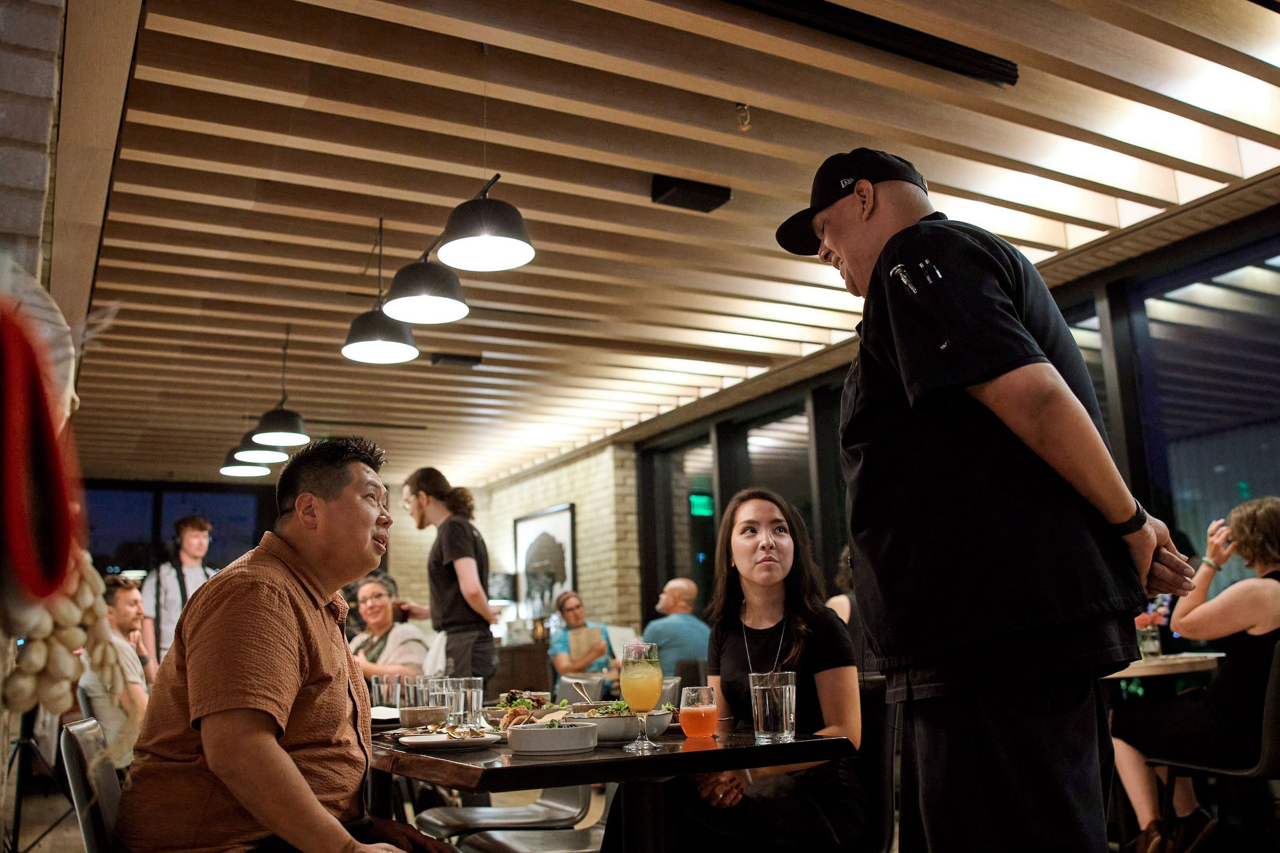
From the Twin Cities to the Iron Range, the North Shore, and everything in between, our unique blend of Indigenous and immigrant flavors has shaped our local food landscape and even proved it’sworthy of a national award or two.
Though the term “Minnesota spicy” is thrown around for some residents’ inability to handle the heat, we more than make up for it with a wealth of other flavors, too. Here are 12 of the most iconic Minnesotan dishes/ingredients, and the best places to sample them throughout the Minneapolis-St. Paul area and beyond.
…
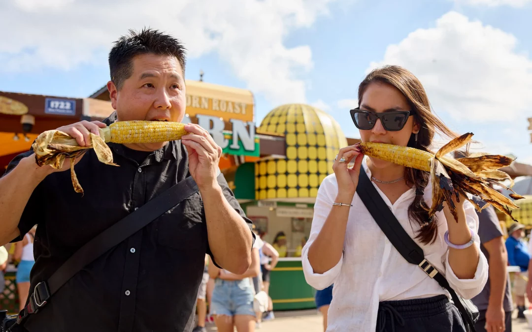
As one of the top four producers in the nation, Minnesota isn’t afraid of getting a little corny. As a state, we produce field corn — used to make everything from ethanol to diapers to plastics — as well as the beloved juicy, sweet corn.
While many of us look forward to the corn roast at the State Fair each year, locals also line up for Oro by Nixta, a James Beard-nominated restaurant in Northeast that specializes in using heirloom varieties of Mexican corn in everything from drinks to entrees and desserts. You can also crunch on countless flavors of popcorn at Tom’s Popcorn Shop or sample a corn cake sprinkled with Cotija cheese (trust us on this one) from Maria’s Cafe at breakfast.
…

Minneapolis was once the flour milling capital of the world (a.k.a. “Mill City”). Its production peak was during World War I, when our 25 stone flour mills helped feed America’s soldiers and allies overseas. Our access to waterways enabled the mills that eventually made Pillsbury — later acquired by the local company General Mills — its home.
While most grain is turned into flour via steel rollers, some smaller-scale local makers are keeping it classic, like Baker’s Field Flour and Bread. They still utilize stone milling and local grains to make their breads and pastries in Northeast Minneapolis’ Food Building.
These days, there’s no shortage of bakeries across the state that use wheat flour to bake delicious breads and pastries. Check out Bloedow Bakery in Winona, World’s Best Donuts in Grand Marais, Raphael’s Bakery in Bemidji, and more.
Want to explore the wide world of wheat and statewide creativity? Novice bakers showcase their skills at the State Fair Baking Competition, and, without flour, we couldn’t have all of the deep-fried treats found at the Great Minnesota Get-Together.
…

Minnesota is home to the largest Hmong population in the United States, with many families arriving as refugees of war in Vietnam and the Secret War in Laos. With their arrival came many beautiful traditions, celebrations, and, of course, delicious food.
Hmong sausage is a dense, snappy link filled with ground pork, lemongrass, Thai chilis, and herbs. Find it while shopping at St. Paul’s Hmong Village and Hmongtown Marketplace, or North Minneapolis’ Good Deal. Their hot bar is full of the nationally recognized Hmong fare — especially sausage — you’ll also find at the rightfully acclaimed restaurants of chefs Diane Mou ( Diane’s Place) and Yia Vang ( Vinai).
…

We can thank horticulturist David Bedford today for one of the state’s culinary stars: our crunchy, juicy, tart-and-sweet Honeycrisps. Initially bred by the University of Minnesota in 1974, they were almost rejected but were given a second chance. They finally hit shelves in 1996, and we’ve been swimming in them ever since.
If you want to grab them from their home at the U, check out the seasonal AppleHouse at the University of Minnesota Arboretum. If you want a little more family fall fun, check out pick-your-own orchards like Aamodt’s Apple Farm, Fireside Orchard, Applewood Orchard, and Carlson’s Orchard Bakery and Restaurant.
…
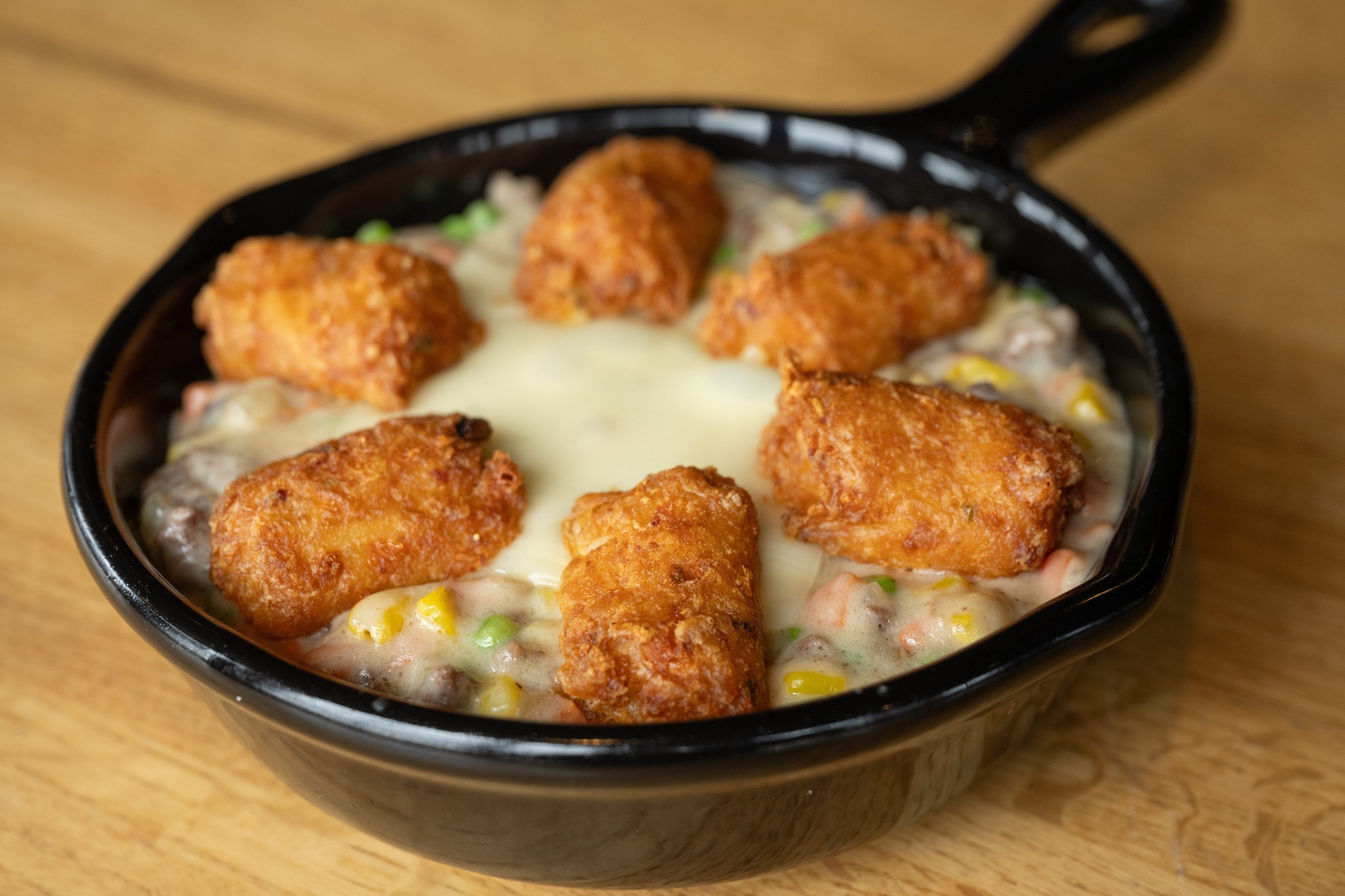
Don’t call it a casserole! While initially used by thrifty housewives to stretch ingredients, hot dish evolved from the cream-of-something-soup with cheese on top to something more texturally spectacular when Ore-Ida introduced their crispy little tater tots, and Minnesotan moms in church basements never looked back.
Check out the Crooked Pint for a taste of home, and Brick and Bourbon and Stray Dog for fancied-up versions that feature beef gravy and smoked gouda, and caramelized Brussels sprouts, truffle oil, and béchamel, respectively.
Prefer two hands to a fork and knife? Trestle Inn’s Minnesota Burger is topped with onions and a crispy shingle of hashbrowns, and smothered in cream of mushroom soup.
…

The cheeseburger is an American classic, but we do things a little differently in Minnesota. Since the mid-1950s, two bars have been duking it out as the originators of the Ju(i)cy Lucy, a flat-top griddled beef patty stuffed with ooey, gooey, melty cheese. Matt’s Bar and the 5-8 Club both lay claim to the original recipe, and others have expanded upon it, too. The Nook in St. Paul and Blue Door Pub have fancied them up with different cheese fillings and meats that are worth gobbling.
Vegan? No problem. Francis Burger Joint has you covered with a dupe that will make you wonder if it’s not the real deal.
…

The Iron Range brought several industrious immigrants to Minnesota for opportunities in the mining industry. Many were Cornish and Italian, and the enduring flavors of the area are reflected in dishes like porketta and pasties.
Hand-held foods were a staple for quick eating and getting back to mining, so the tradition of pasties — savory meats and root veggies tucked into a flaky, braided pastry crust — was a no-brainer for miners’ lunchboxes. Find the real deal in droves at the Iron Range Pasty Festival, or look for the Potter’s Pasties truck at events.
Porketta, an Iron Range adaptation of Italian porchetta, utilizes more widely available cuts of meat like pork shoulder that’s sliced, packed with fennel and garlic, rolled, and slow-cooked. It’s then shredded and served on a roll. Try it at Northbound Brewpub (a favorite of Guy Fieri), Iron Ranger, or the lunch counter of Hagberg’s Meats.
…

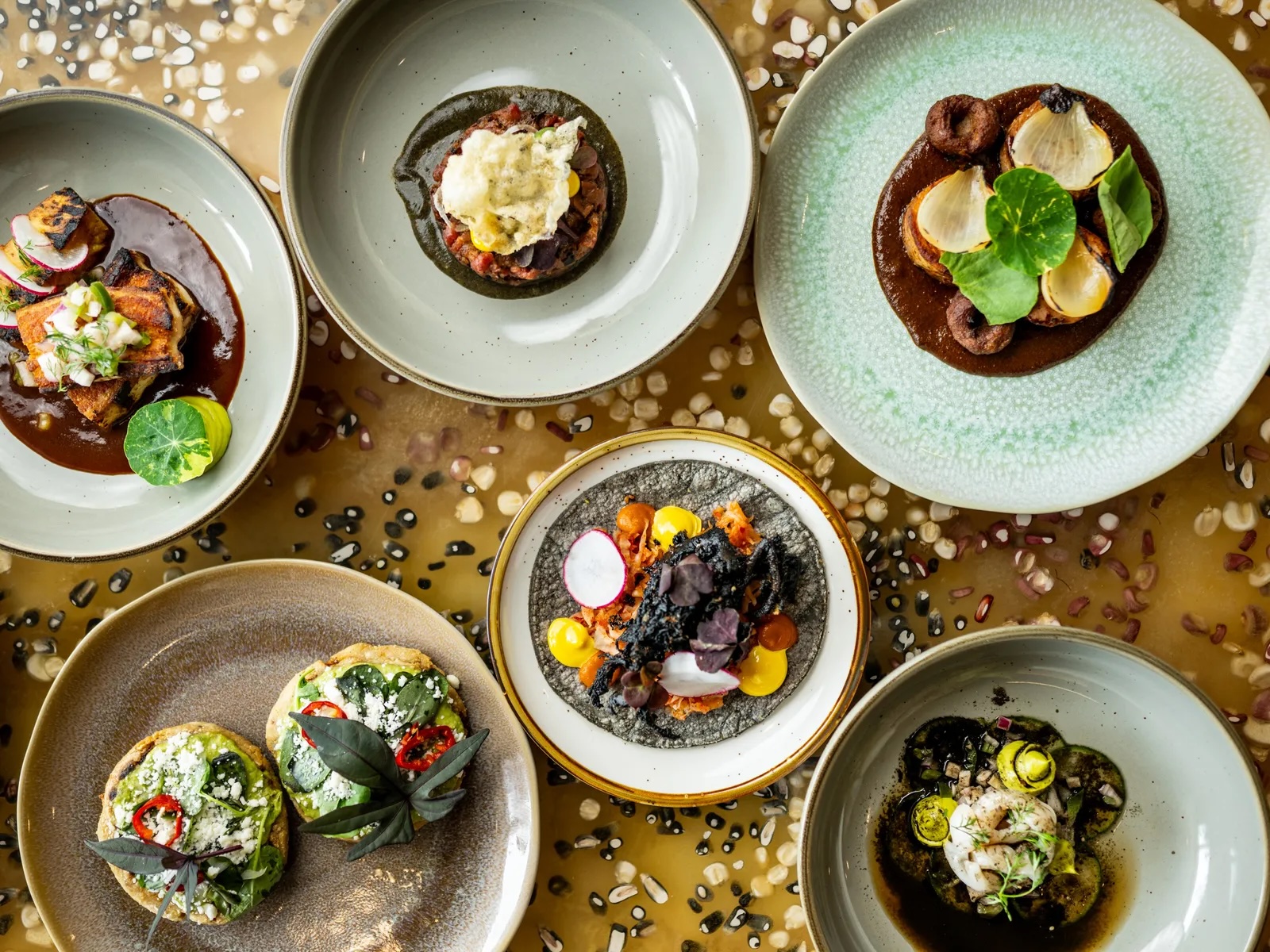
Minnesota is home to one of the largest East African immigrant populations in the United States. Along with cultural traditions that add vibrancy to our communities, food traditions like sambusas also enrich our regional cuisine. Warmly seasoned ground meats or lentils fill thin sheets of pastry shaped into triangles that are then fried to a golden brown.
Whether served as an appetizer or eaten as a full meal, they are a deeply satisfying and crunchy delight. Try them for yourself at Mama Safia’s Kitchen, Afro Deli, or Bolé Ethiopian Cuisine.
…
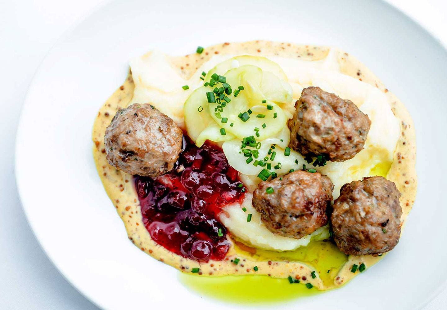
Skip IKEA; we’ve got the real deal at home. Swedish immigrants brought many food traditions to Minnesota, and not all are as infamous as lutefisk.
Hearty meatballs served over mashed potatoes or noodles are sure to stick to your ribs and keep you warm throughout our long winters — but who are we kidding? They’re delicious year-round. Find them at Ledge Rock Grille in Duluth, at the American Swedish Institute’s FIKA cafe, and Cambridge’s Leader.
Gustaf’s on Main in Lindstrom, MN, also hosts the MidSommer Swedish Meatball dinner during the town’s Midsommar festival.
…

Many of Minnesota’s own residents don’t realize it’s the nation’s top turkey producer. About 1 in 5 turkeys are raised right here — often from Willmar’s Jennie-O, the country’s national leader.
Try it in a mid-century classic: open-faced, hot and soaked in gravy on a bed of mashed potatoes at Lynde’s in Osseo, or Oasis Cafe in Stillwater. You can also grab a juicy sandwich or BBQ sauce-slathered leg from the famous Turkey To Go stand at the State Fair.
If you’re looking for a new take on turkey, look no further than The Kitchen; they have a turkey leg that’s stuffed with macaroni and cheese and sauced-up shrimp.
…

Minnesota’s state fish loves cruising large, cool lakes, and they are especially plentiful in northern lakes — good eating with thick, meaty fillets.
Fishing in our local lakes is not approved for commercial sale, so most of the prepared fish you see on menus is from Canada. However, the Red Lake Nation sources local walleye that is distributed to select restaurants across the state, including Gianni’s Steakhouse in Wayzata, FireLake in Bloomington, Brookside Bar and Grill in Marine on St. Croix, and Minnetonka’s Bacio, to name a few.
If you’re craving something a little different and aren’t committed to local fish, Creekside Supper Club offers a classic fish fry or a more upscale crab-stuffed version.
…
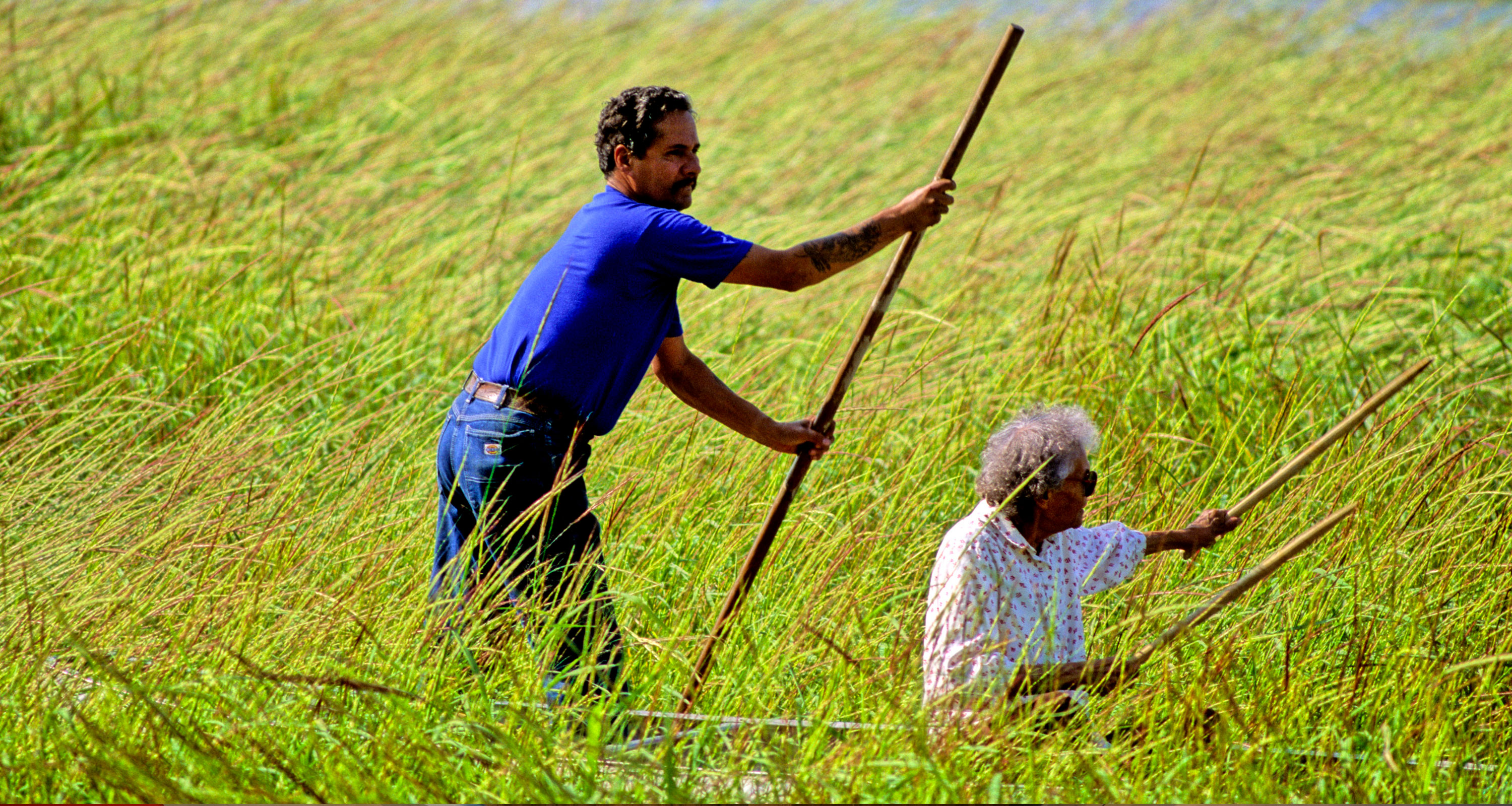
One of the largest Tribal Nations in Minnesota is the Ojibwe, and wild rice, or manoomin, is a culturally and culinary important staple native to our state. Before colonialism’s impact on natural resources and its appropriation for trade and use as a scarce, high-end ingredient, harvests of this aquatic grass (though it’s a grain, it’s not actually rice) were abundant enough to sustain Indigenous families over a year.
Wild rice is ready for harvest in late summer, and traditional methods for gathering the flavorful, high-nutrient rice that grows in and around Minnesota’s waterways involve knocking the ripe grains of rice from the stalks into a canoe. Before it can be stored, it is roasted — a method known as parching — and the hull is loosened from the grains by a process known as threshing. Traditionally, threshing is done by someone walking or dancing on the grains. Then, finally, the hulls are separated from the grains by tossing them in birch bark trays that allow the inedible hulls to blow away. The traditional process is beautiful, intentional, and communal.
The demand for the grain prompted the University of Minnesota to begin domesticating and hybridizing wild rice in paddies in 1960, which allowed for greater access to the grain, but with trade-offs in flavor and texture. To this day, the fluffiest, most tender wild rice comes from Indigenous growers. Try it in several preparations at Owamni, James Beard winner Sean Sherman’s restaurant that centers on Indigenous foodways.
Minnesota is also home to two wild rice festivals — one in Roseville, and the world’s largest in Deer Creek — that showcase traditional foods, music, demonstrations, and activities. Looking to warm up with a bowl of creamy or brothy wild rice soup? Check out this list for three metro-area spots to find your new favorite.
…
Natalia Mendez is a former Wisconsinite who never lost her love for cheese, big lakes and going “Up North.” She now lives in Minneapolis near lots of smaller lakes, and spends time in Minnesota’s north woods as much as possible. When not dreaming of her next two-wheeled adventure, she can be found cooking and eating elaborate meals or petting her cats, Cosmo and Carl.