Minneapolis-based Valspar is a subsidiary of Cleveland-based Sherwin-Williams Co.
Aspire Design And Home: Today, industry leading paint and coatings brand, Valspar, from the Sherwin-Williams Consumer Brands Group, announces its 2021 Colors of the Year with 12 livable shades that evoke calm, serenity and simplicity. With this palette, Valspar seeks to empower consumers to take control of their environments and create spaces that will expand their worlds, calm their minds and enrich their lives.
When forecasting the 2021 Colors of the Year, the color experts at Valspar observed global lifestyle trends that have shifted significantly from last year. The rise in external stressors has correlated with consumer’s increased interest for mindfulness and self-care activities. Since a physical space can directly impact your mindset, this year’s colors have been selected to bring a sense of wellbeing to your walls, ultimately blending home improvement with self-improvement. Valspar’s 2021 Colors of The Year help take the guesswork out of color selection, so that consumers can easily navigate DIY projects and take charge of their physical spaces, so they help foster their best mental space.
“Our homes have become offices, entertainment centers and classrooms – which means the colors, sights and sounds in our rooms have an even bigger impact on our daily lives” said Sue Kim, Valspar Color Marketing Manager. “These lifestyle changes coupled with a surge in DIY home activity helped guide our selection of a range of colors for Valspar’s 2021 Colors of the Year that can not only transform your space but also elevate your mood.”
With do-it-yourselfers in many areas of the United States continuing to spend more time at home compared to past years, Valspar projects that this renewed focus on improving interiors will extend well into 2021 and beyond.
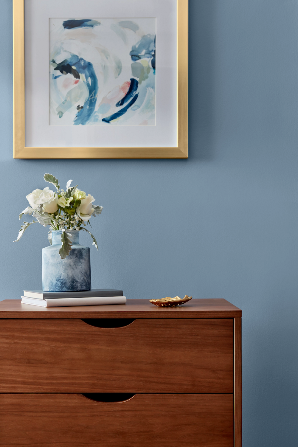
Blissful Blue – Naturally Timeless, Organic Haze. This muted indigo taps into the organic tones of a morning mist.
Design tip: Soft, grayish blues can act as neutrals, making them easy colors to design around.

Soft Candlelight – Optimistically Warm, Inviting Radiance. This mature yellow lights up a space with a golden glow.
Design tip: Yellow hues feel cheerful and help elevate your mood.

Granite Dust – Organically Urban, Cool Comfort. Inspired by the protective qualities of natural stone, Granite Dust allows you to create your own personal haven.
Design tip: This versatility of the shade allows it to read warm or cool, providing flexibility to adapt to your décor.
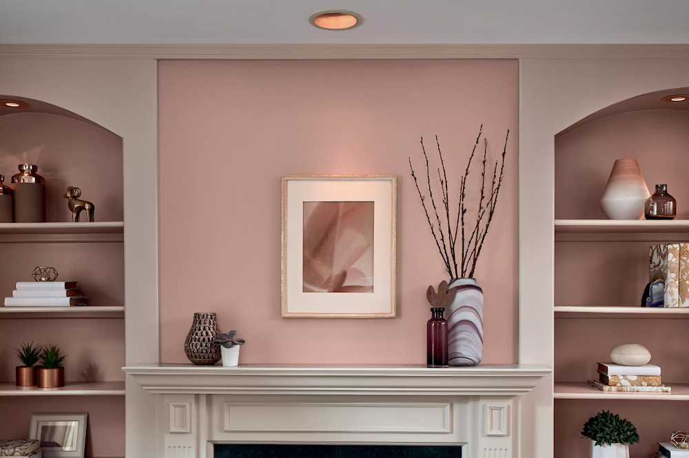
Cherry Taupe – Earthy Pigment, Natural Warmth. Cherry Taupe is a botanical neutral that adds rich sophisticated softness.
Design tip: Gold accents elevate organic, earthy colors.
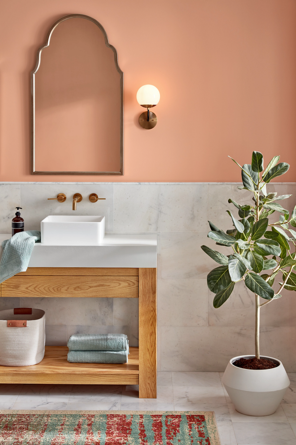
Arizona Dust – Naturally Bold, Easy Energy. This Modern apricot shade with a bold twist evokes our desire to embrace vibrant tones from nature.
Design tip: Consider this playful hue in a satin sheen for added moisture resistance in spaces like bathrooms and mudrooms.
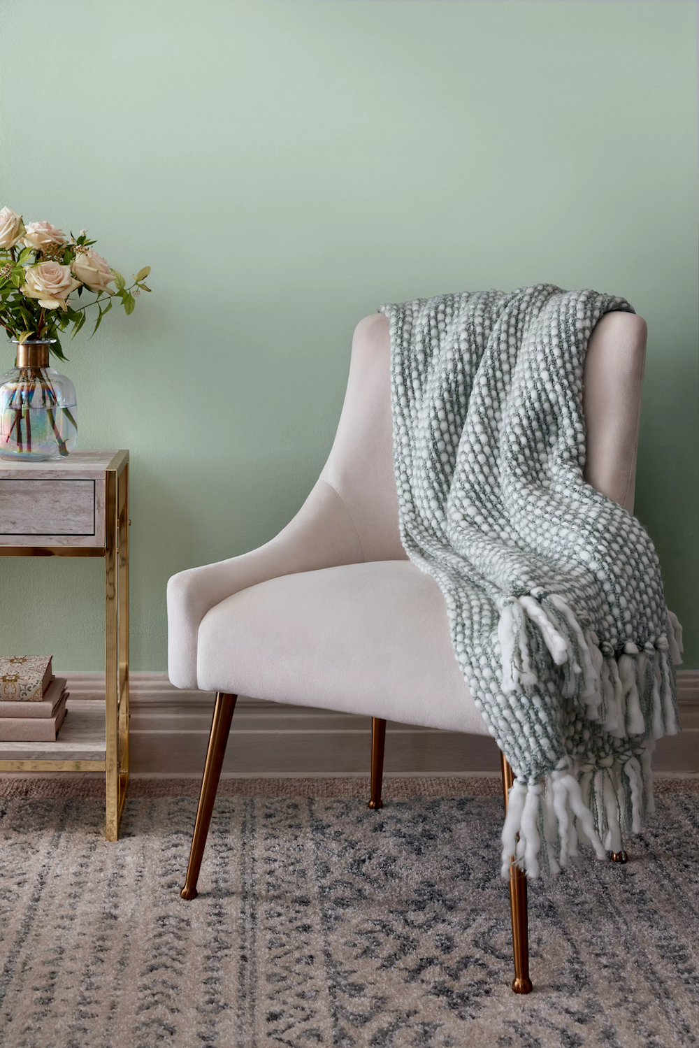
Garden Flower – Clean Growth, Fresh Florals. Modernly classic like the beauty of white roses, this natural tint is soft and simple setting our mind at ease.
Design tip: Black and white decor compliments colorful walls.
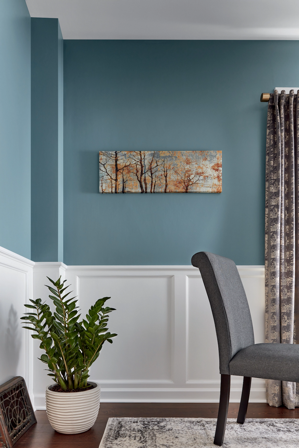
Academy Gray – Contemplative Depth, Moody Comfort. A deep blueish gray that promotes the importance of time spent at leisure, allowing us to unwind and relax.
Design tip: Wainscoting lends architectural charm to spaces with luxurious color.
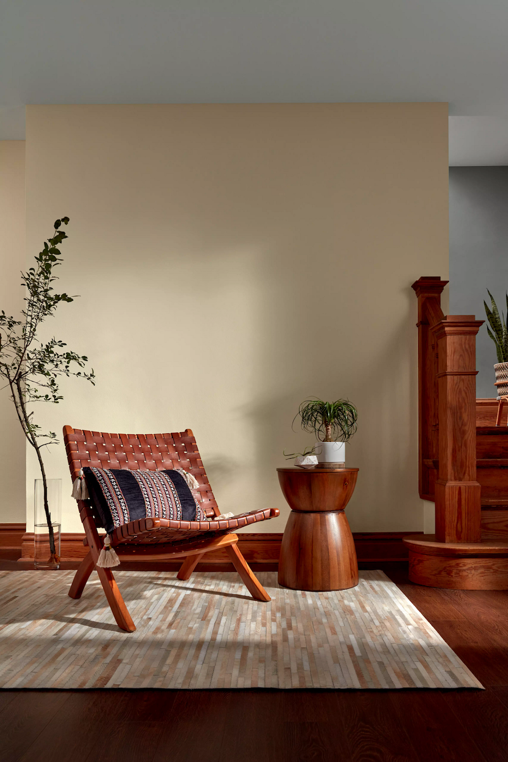
Unforgettable – Luxurious Relaxation, Soft Ease. A shade with no time restraint, this white has warmth to soften rooms and lend an elevated sophistication.
Design tip: Medium-toned wood accents, paired with soft cream walls, create a down-to-earth space.
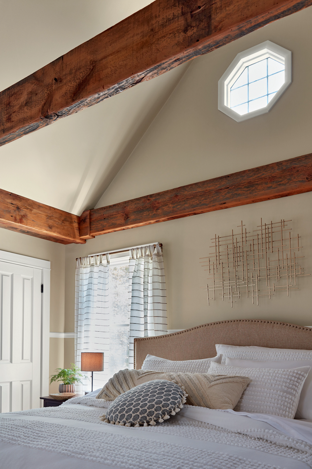
Gallery Gray – Soft Confidence, Approachable Elegance. Embodying minimalism, this fresh shade of warm grey inspires a feeling that is modern and natural.
Design tip: Bold architectural features take center stage against gentle gray walls.
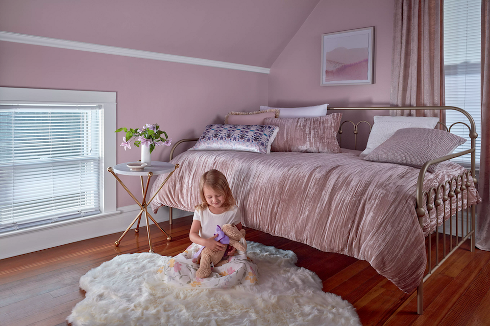
Dusty Lavender – Shadowy Pastel, Balanced Vibrancy. Natural dyes are introducing new pastels into the home. Dusty Lavender creates a soft but unexpectedly dynamic feel that is warm and inviting.
Design tip: Carry color onto ceilings to give small rooms a larger appearance.
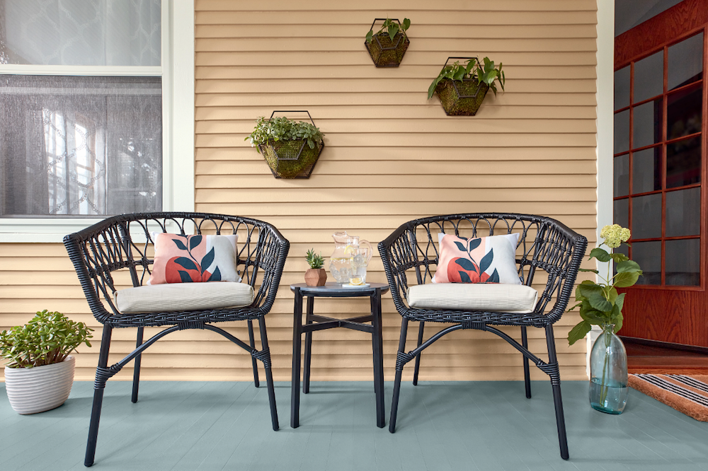
Maple Leaf – A warm camel shade that has an authentic quality, embracing our appreciation for a handmade craft.
Design tip: Living plants add freshness and vitality to neutral spaces.

Lucy Blue – Effortlessly Optimistic, Joyful Energy. Familiar and calming, like the waves of the ocean. We look to blue to bring a playful happiness into the home.
Design tip: Neutral furnishings add sophistication to vibrant spaces.


